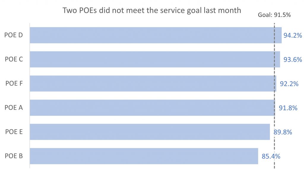
When you are showing ranked data in a bar chart you may want to add a goal or target line to easily identify those with performance above the goal and those below the goal. Instead of drawing the line on top of the chart, build the target or goal line as part of the chart so it updates automatically when the data or the goal updates.
In the video below you will see me build this chart. Here are the basic steps.
Create the bar chart data table
Creating the data table for the bar chart is easy because it is a standard bar chart. I check to make sure that the horizontal axis will start at zero and if needed I include an invisible data series with a zero value to force it (see this video for more on this technique). I sort the data so it is ordered largest to smallest.
Create the goal line data series
The goal line is a scatter with straight lines chart so I create the x and y values to position the line at the correct value in the bar chart. I also set the series name to include a colon because it will be used as part of the label.
Create the bar chart
I use the bar chart data table to create a standard bar chart. I format it so the bars are ordered largest to smallest, the bars are wider, the bar fill color is light enough so that the goal line will be visible on top of the bars, the chart doesn’t have gridlines, and the bars have formatted data labels with a semi-transparent fill color outside the bars.
Add the goal line to the bar chart
I add a data series to the bar chart. I change it to a scatter with lines chart and add the x values so it appears in the correct position. I adjust the secondary vertical axis so that the line extends above the top bar and below the bottom bar. I add a data label to the top point that includes the series name and the goal value.
Full video

Dave Paradi has over twenty-two years of experience delivering customized training workshops to help business professionals improve their presentations. He has written ten books and over 600 articles on the topic of effective presentations and his ideas have appeared in publications around the world. His focus is on helping corporate professionals visually communicate the messages in their data so they don’t overwhelm and confuse executives. Dave is one of fewer than ten people in North America recognized by Microsoft with the Most Valuable Professional Award for his contributions to the Excel, PowerPoint, and Teams communities. His articles and videos on virtual presenting have been viewed over 4.8 million times and liked over 17,000 times on YouTube.