When you want to visually compare the proportions of two related items, a speedometer graph line this can be an effective visual to use.
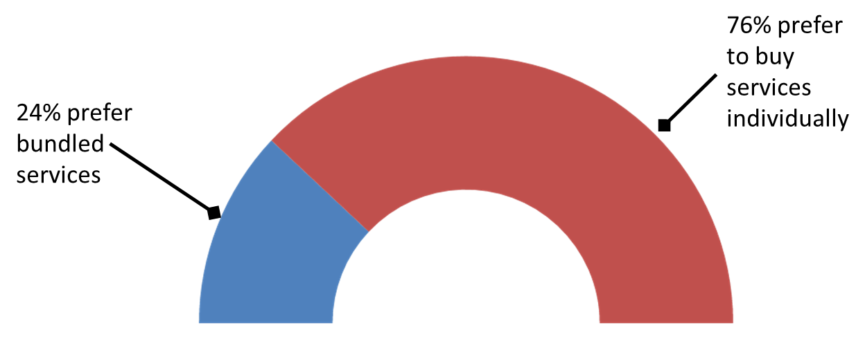
This is a visual you will see in newspapers and magazines. They have professional graphics staff create these visuals, but you can create it in PowerPoint. This video shows you step-by-step how to create a speedometer graph on your slide. Click the Full Screen button in the lower right of the video to make it as large as your screen so it is easier to see the step-by-step instructions.

Dave Paradi has over twenty-two years of experience delivering customized training workshops to help business professionals improve their presentations. He has written ten books and over 600 articles on the topic of effective presentations and his ideas have appeared in publications around the world. His focus is on helping corporate professionals visually communicate the messages in their data so they don’t overwhelm and confuse executives. Dave is one of fewer than ten people in North America recognized by Microsoft with the Most Valuable Professional Award for his contributions to the Excel, PowerPoint, and Teams communities. His articles and videos on virtual presenting have been viewed over 4.8 million times and liked over 17,000 times on YouTube.