In my customized training courses I suggest that business professionals should create diagrams in PowerPoint using shapes instead of using SmartArt. One reason SmartArt is so popular is that it is quick and easy to add. The problem is that SmartArt is not very flexible and it takes control of what the visual will look like.
When you learn some of the techniques for working with shapes in PowerPoint you discover that you can create customized diagrams that have better design and functionality than SmartArt. Here are some sequence diagrams inspired by recent slide makeovers I used in my courses with clients.
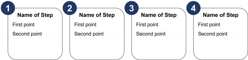
This first example is a step up from the standard rectangles. It uses filled circles overlapped on the top left corner of rounded rectangles. Some of the techniques used are layering objects using the Selection Pane, adding line spacing to text, and an advanced technique to align objects.
The second example uses the chevron shape which is popular for sequence diagrams as it indicates a step and a direction in one shape. I’ve added a custom shape to the bottom of each chevron to tie the explanatory text to the shape. Some of the techniques used are creating a custom shape by merging two rectangles (I demonstrate merging shapes to create a custom shape in this video), adjusting the top text margin within a shape, and equal horizontal distribution of groups of shapes.
This final example takes the idea of shapes on an arrow to the next level and looks like I have hung each of these step explanations from the arrow. Some of the techniques used to create this visual include layering of shapes to create each group (each group has a filled circle, a triangle underneath with the top corner covered up, a rectangle for the step name, and a second rectangle for the details of each step), color contrast between the name and detail text, and grouping to duplicate.
These are just some of the techniques I teach in my Practical PowerPoint Skills Training courses. I create makeovers of slides the participants use in their presentations. In each session I show the makeover and then demonstrate the techniques to quickly and easily create the visual in PowerPoint. Instead of struggling for an hour trying to create a diagram, or giving up and using SmartArt that doesn’t really fit the message, participants in my courses learn the techniques they can use right away to create effective visuals in PowerPoint.

Dave Paradi has over twenty-two years of experience delivering customized training workshops to help business professionals improve their presentations. He has written ten books and over 600 articles on the topic of effective presentations and his ideas have appeared in publications around the world. His focus is on helping corporate professionals visually communicate the messages in their data so they don’t overwhelm and confuse executives. Dave is one of fewer than ten people in North America recognized by Microsoft with the Most Valuable Professional Award for his contributions to the Excel, PowerPoint, and Teams communities. His articles and videos on virtual presenting have been viewed over 4.8 million times and liked over 17,000 times on YouTube.