Most business professionals are familiar with creating graphs in Excel using the powerful built-in graph features. Today I want to show another feature of Excel that can be used to create a bar graph quickly in Excel. It has limitations but can be particularly useful when you want to create multiple bar graphs of related data.
This is an example of a graph created using the conditional formatting data bars feature of Excel.
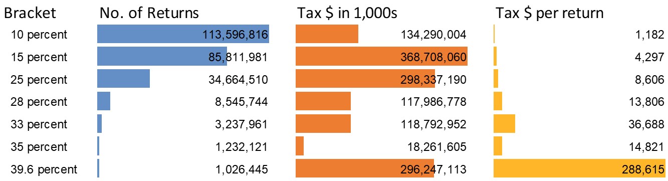
These bar graphs are not created using the Excel graph feature. They are created using a feature that allows you to format cells with bars that correspond to the values in the cells. After you enter the data into a column of cells, select the cells and click on the Conditional Formatting button on the Home ribbon. Select the Data Bars option and select the color you want to use for the bars. You can select the More Rules option to explore more capabilities of the feature or to set the bar color to one that you select instead of the six default colors shown.
After you create the bars, there are a few formatting choices I suggest you consider. First, make sure that the bar color is light enough that the cell value can still be seen. This is why you may need to select a different color using the More Rules option. Second, format the cell values using the appropriate number format option.
Third is to set up for displaying the graph in your presentation. By default the longest bar fills the entire width of the cell. If you have bars in adjacent cells, they will possibly run into each other. I suggest you place divider columns in between the columns you are using to show the bars. I usually set the divider column to be 10% of the width of the columns with the bars. Fourth, turn off the gridlines. When you do, the graph is much less cluttered.
Now you are ready to copy the graphs into PowerPoint. PowerPoint does not recognize Excel’s conditional formatting graphics such as the bars. Select the cells in Excel and copy them. When you paste into PowerPoint, use the Paste Special menu to select the Picture (Enhanced Metafile) option. This is a vector format image which means it will scale without getting fuzzy looking.
If the sets of bars have the same measurement units, you will need to scale the column widths to make sure the comparison is correct. Here is an example from a customized workshop earlier this year.
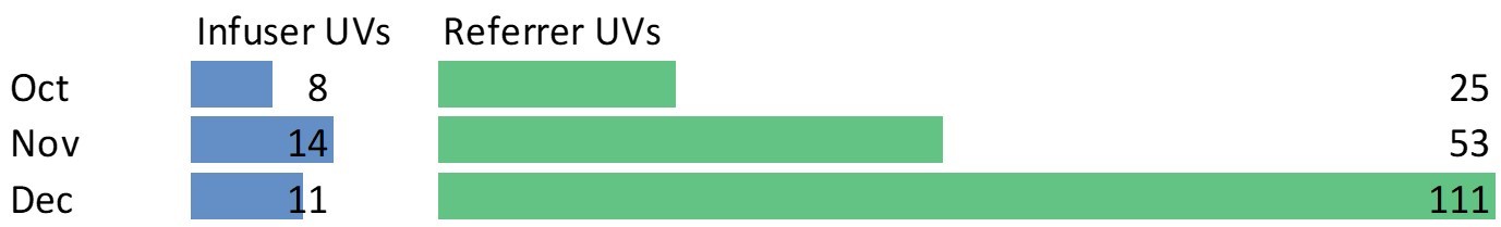
Since both bars represented unique visitors (UV), I needed to set the width of the columns to be proportional to the maximum values so the bar lengths showed a true comparison.
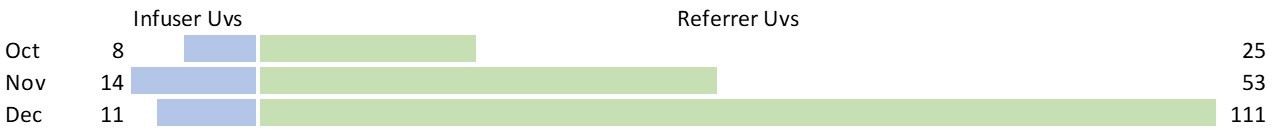
When you explore the options for the data bars conditional formatting, you will discover that you can create diverging bar charts for related data and place the values in separate cells from the bars. The graph below is an example that shows the same data as above.
Excel’s conditional formatting data bars is one of the features I’ll be covering tomorrow in my sold-out course for CPAs in Vancouver BC. If you are a CPA in the US, my customized workshops are now registered with NASBA and qualify for CPE credits. If your group wants to learn how to create effective presentations of data and get the recertification credits you need, get in touch.

Dave Paradi has over twenty-two years of experience delivering customized training workshops to help business professionals improve their presentations. He has written ten books and over 600 articles on the topic of effective presentations and his ideas have appeared in publications around the world. His focus is on helping corporate professionals visually communicate the messages in their data so they don’t overwhelm and confuse executives. Dave is one of fewer than ten people in North America recognized by Microsoft with the Most Valuable Professional Award for his contributions to the Excel, PowerPoint, and Teams communities. His articles and videos on virtual presenting have been viewed over 4.8 million times and liked over 17,000 times on YouTube.