Making text look better on slides is clearly a popular topic. The article I wrote based on Johanna Rehnvaal’s work in Issue #335 of this newsletter had more replies and about double the clicks compared to a typical newsletter. Despite what some designers say, text slides are here to stay and are an essential part of business presentations. Today I want to show you how to create some of the designs Johanna showed using only the tools in PowerPoint. This is a longer article because I wanted to give you the steps you need to create these designs.
Design #1: Grouped rectangles
 This design is created by using rectangles that are grouped together. Each group has a heading rectangle (or square) and a text rectangle. While I have shown a numbered list in the example above, you can use this look for text headings and related text as well. You can also orient the sets of rectangles vertically instead of horizontally, with the headings on top of the related text.
You create this in PowerPoint by using rectangles positioned beside each other. A few notes on creating this design:
- Each shape should have No Line so that the shapes line up better
- Use the Snap Objects to Each Other option to get the two shapes to fit together perfectly for each group
- Group the first two related shapes together so you can copy the group and move the group more easily
- In-group editing (introduced in PowerPoint 2007) allows you to edit the text inside each shape in the group without ungrouping the shapes
- You can set the horizontal and vertical alignment of the text in each shape separately as shown in the example above
- Use the Align and Distribute tools to make the groups line up and be properly distributed
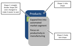
Design #2: Rounded rectangle shapes
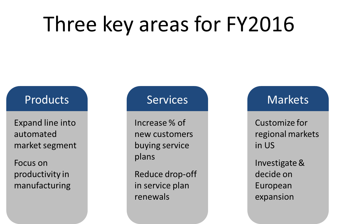 This design is a little more complicated to create. It is easier in newer versions of PowerPoint that include the Combine Shapes feature, but it can be created using three layered shapes in any version of PowerPoint. It can be oriented vertically or horizontally. Here is how you can create this design:
- Shape 1 (title shape): Draw a rounded rectangle that will be for the heading (the dark blue shape in the example above). Set the fill color and No Line for the line color. Draw the shape so it is approx. 80% of the height of the overall shape you want. Since rounded rectangles in PowerPoint change the shape of the corners when sized, you want the corner to be the final size since you will use this exact shape later.
- Shape 2 (straight divider shape): Draw a rectangle that covers up the rounded part of shape 1. Set the fill color to a contrasting color (grey in the example above), no line color, and position it so it leaves the top portion of shape 1 still visible. This shape is only used to create a straight divider line between the title and body text shapes.
- Shape 3 (body text shape): Copy shape 1. Set the fill color to that of shape 2, no line color, and position this shape so the top is the same as the top of shape 2.
- Set the vertical and horizontal text alignment of shape 1 so that the title text will be seen in the shape (top vertically and centered horizontally in the example above). Add the title text in a color that contrasts with the shape fill color.
- Set the vertical and horizontal text alignment of shape 3 so that the body text appears the way you want it to (top vertically and left aligned horizontally in the example above). Add the body text in a color that contrasts with the shape fill color.
- Group the three shapes so they can be copied and moved. Use the Align and Distribute tools to make the shapes line up and be evenly distributed.
- The key to making this work is to have the three shapes layered correctly: shape 1 is on the bottom, shape 2 next, and shape 3 on the top. Here is a look at the layers in three different colors and shifted slightly so you can see them more easily:
Design #3: Icons with text
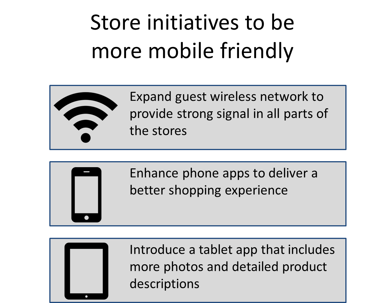 This look combines icons that illustrate the ideas with text that gives more explanation. In Issue #325 I explained more about using vector icons, and the icons used in the example above come from the iconmonstr.com site mentioned in that article. Here are some tips for creating this type of slide in PowerPoint:
- Draw the rectangle shape and set the fill and outline colors as you wish. When you add text to the shape, adjust the left text boundary in the ruler to leave space for the icon (if you want the icons on the right, adjust the right text boundary in the ruler).
- Insert the icon image (using a PNG image allows the background to be transparent) and size it to fit the area you have left for it in the shape. Align the shape and the image using the Align Middle tool so they are properly aligned.
As presenters, we don’t need to be designers to add some visual interest to the text on our slides. I am not a designer, but I have been inspired by Johanna and figured out how to recreate some of the ideas she shared without having to use design software. If you have PowerPoint, you can create these looks with a little practice.
Do you want more alternatives to using the default bullet points and video training on how to create the slides? If so, check out my e-course Alternatives to Bullet point text

Dave Paradi has over twenty-two years of experience delivering customized training workshops to help business professionals improve their presentations. He has written ten books and over 600 articles on the topic of effective presentations and his ideas have appeared in publications around the world. His focus is on helping corporate professionals visually communicate the messages in their data so they don’t overwhelm and confuse executives. Dave is one of fewer than ten people in North America recognized by Microsoft with the Most Valuable Professional Award for his contributions to the Excel, PowerPoint, and Teams communities. His articles and videos on virtual presenting have been viewed over 4.8 million times and liked over 17,000 times on YouTube.