When presenting ideas that include references to data, it can be helpful to make the point using a graph or table. These visual methods can make the point much stronger than simply describing the data. While they can be powerful methods, they also have the potential to ruin a presentation if they convey the wrong message or they confuse the audience. Appropriate use of graphs and tables is one way to enhance the message you are delivering. (Do you use Excel data in PowerPoint? If so, check out this page on presenting financial information effectively)
Graph Types
There are five basic types of graphs that are used most frequently. There are more complex types that are used for specific purposes, usually technical in nature, which will not be discussed here because they would rarely be used by most of us. A graph is really a graphical representation of one or more sets of data. A set of related data is referred to as a data series. For example, the sales of product X each year for the past five years would be one data series. Here are the five basic graph types:
Area – This graph shows the relationship of different parts to a whole over time. One example would be to show the breakdown of the total organization profit by product line over the last five years. This graph can show many (4-6) data series at a time.
Column – This graph shows the differences in individual values vertically. It can be used to show the differences between values in different time periods or other data groupings. Examples include showing the total number of phone calls each month for the past year or the number of orders received by each order method (fax, phone, e-mail, web, walk-in) over the last month. This graph works best with fewer (1-3) data series.
Bar – This graph shows the differences in individual values horizontally. It is not a good choice for showing values in different time periods. It works better for showing the results of one or two data series. One example would be to show the popularity of the top eight answers to a survey question.
Line – This graph shows values at different points in time. It is usually best to have equal time intervals along the horizontal axis of the graph. One example would be to show the trend in the number of customer service calls handled by the five offices each month over the last year. A line graph can display many (4-6) data series quite well.
Pie – This graph shows the proportions of each segment of a whole. This graph only handles one data series. An example would be to show the proportion of funding provided to the organization by each level of government in the past year.
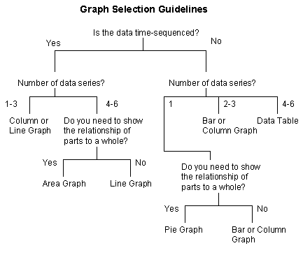
When you are deciding which type of graph to use for your situation, the decision tree below can help you. The key questions to consider are whether the data is time-sequenced and how many data series you want to show. By selecting the appropriate graph type, you can help make the message clearer to the audience.
Key Graph Elements
Colors – Make sure that you set the background color and the color of each data series so that there is enough contrast to be seen clearly by the audience. These colors should also be consistent with the overall color scheme of the slides so that the graph does not look out of place.
Depth – The depth of the graph refers to whether the graph is 2-D or 3-D. There is almost no value ot the third dimension, and I suggest graphs be 2-D.
Axes – All of the above graph types except the pie graph have two axes. One is for the data values and the other is for the time scale or how the data is separated. It is important to set the scale of the axes to be appropriate to the data being shown. Also, make sure that axis labels that indicate the values along each axis are big enough to be clearly read when the graph is displayed. If the axes are not clear, the graph may be misinterpreted because it is not clear to the audience what the difference between the data is.
Data Labels – When you need to more clearly indicate the data value in a graph, you can use a data label. This is a text box that contains the actual data value and it should be placed close to the graphical representation of the data point, whether it is at the end of a bar or column, above a data point on a line graph or inside the pie section in a pie graph. Make sure that the text is big enough to be read clearly and that the text color has enough contrast with the color underneath it.
Title – The title of the graph should focus on the interpretation of the data, not the data itself. Remember that we are using a graph to help make a point, and the title will be a key factor in the audience interpreting the graph properly. For example, instead of a title like “Sales 1996-2001”, you could say “Sales Up 42% ’96-’01”. There is usually no need for a separate tile on a graph since the slide headline will communicate the meaning of the graph.
Legend – If you have more than one data series on a graph, you should add text labels to indicate each series instead of using a legend on the graph. Research shows that a legend distracts the audience by forcing them to split their attention between the data in the graph and the explanantory text in the legend, reducing their understanding of the graph. Instead, put any explanatory text in the graph using text boxes.
Creating the Graph
Most presentation software packages have a built-in graph creation tool. For earlier versions of Microsoft PowerPoint, it is the Microsoft Graph application, and later versions use Microsoft Excel. Most of these tools are quite robust and will meet the needs of most presenters. If you want to use a graph, understand within your presentation software how to create and edit a graph, especially the elements listed above. There are specialized graphing software tools available, but these are required only when you need to use certain complex graph types or require features that are not included in the built-in tools. One way to extend the capabilities of the built-in graphing tool is to use the graphing tool to create the basic graph, and then use the drawing tools of the presentation software to add specific elements that are required for your purposes, such as lines, text boxes or arrows. Importing a graph from another software package, such as a spreadsheet is not always a good idea because it is harder to get the colors right on the import translation and it is harder to edit since the other software package must be started to do the editing.
Tables
The basic structure of a table is a set of columns and rows that contain the data and usually contain either a row or column (or both) of headings that organize the data. When deciding on the size of the table, it is a good idea to keep the six by six guideline in mind. Used in the context of tables, this guideline suggests that a table should try to have no more than six columns and no more than six rows in order to keep the amount of information to a reasonable level. In selecting the size of the table, make sure that the font size of the text in each cell of the table is big enough to be read clearly when displayed. A table is generally less effective than a graph because it only shows the data, whereas the graph shows an interpretation of the data, which is easier for the audience to understand. When you are presenting a table, you will need to provide the interpretation of the data for the audience. One way to make certain cells stand out is to change the background color of the cell or enhance the text by changing the color or making it bolder. Column and/or row headings should be bolded to distinguish them from the data. Most presentation software packages have a built-in table creation tool that will serve most purposes quite well. Importing a table from another software package, such as a word processor is not always a good idea because it is harder to get the formatting right on the import translation and it is harder to edit since the other software package must be started to do the editing.
Adding Emphasis
When using a graph or a table, you should emphasize the key parts so that your points are stronger. One way to add emphasis is to animate the graph or table elements so that they appear one-by-one instead of all at one time. This allows you to discuss each element or data series individually and keep the audience focus on the message you are delivering. Using animation effects is much better than trying to point different elements out using a pointer device such as a laser pointer. So you don’t have to stand beside your computer to advance each build on the slide, use this remote, the one I have relied on for over a decade.
You can also use drawing tools such as arrows and boxes to highlight a portion of the table or graph. You can use a strong contrasting color for the drawing element to visually draw the audience’s eyes to that part of the graph or table. Most presentation software packages also have a callout box drawing tool. This tool places a line pointing at a certain spot on the graph and then links that line to a box that contains text to explain the significance of the area being pointed to. I use this in one graph to replace a legend.
By properly using graphs and tables, you can add visual elements that enhance your message.
Did you find this article helpful? If so, click here to check out some great learning tools to help even more!

Dave Paradi has over twenty-two years of experience delivering customized training workshops to help business professionals improve their presentations. He has written ten books and over 600 articles on the topic of effective presentations and his ideas have appeared in publications around the world. His focus is on helping corporate professionals visually communicate the messages in their data so they don’t overwhelm and confuse executives. Dave is one of fewer than ten people in North America recognized by Microsoft with the Most Valuable Professional Award for his contributions to the Excel, PowerPoint, and Teams communities. His articles and videos on virtual presenting have been viewed over 4.8 million times and liked over 17,000 times on YouTube.