Results of the 2019 Annoying PowerPoint survey
Executive summary:
PowerPoint is being used to create “brain dump” documents that are projected on a screen and called presentations. Audiences want concise, well-structured visual presentations that are delivered in an engaging manner. [Click here to see what has changed with presentations going virtual]
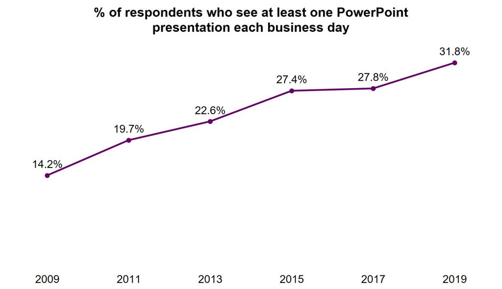
Presentations are becoming the de facto method of communication
The 236 respondents to the 2019 Annoying PowerPoint survey are seeing more presentations than ever before. Almost 32% say they see at least one presentation every business day, and over 78% say they see two or more each week. This is an increase from the 2017 survey and continues a trend that has been growing for well over a decade.
PowerPoint is becoming the default for communication in organizations. One respondent said they see, “A culture here at work that wants to throw everything into a PowerPoint presentation.” The software is so easy to use to incorporate text and visuals that it has become the standard in so many organizations. In fact, one respondent lamented that, “We’ve forgotten how to communicate any other way.”
PowerPoint is a great tool, and it has many great features, but it is important to separate the tool from the output. As I wrote in this article, just because you are using PowerPoint does not mean you are creating a presentation. Every Word document is not a mystery novel and every Excel spreadsheet is not an annual budget. Business professionals need to be careful about the difference between the tool and the output.
Reading a “brain dump” report is not an effective presentation
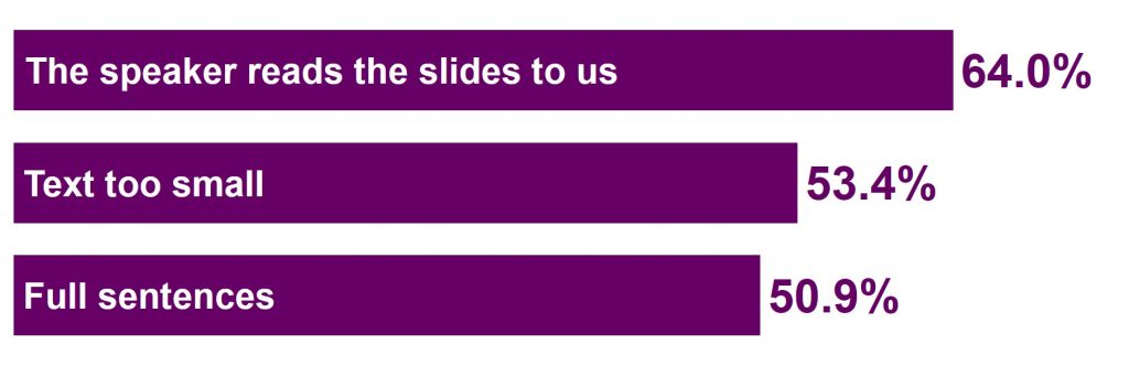
I ask audience members who take the survey to tell me what annoys them about bad PowerPoint presentations. I ask them to pick their top three from a list of twelve options. Again in this survey, as in all nine surveys starting in 2003, the top annoyance is the presenter reading the slides to the audience. The top three are rounded out by using text that is too small to read and using full sentences on the slide instead of text points. This top three has not changed in many years.
In this survey the next most popular group of responses gave a clue as to the cause of this overload of text in presentations. The presentation not having a clear purpose and the presentation not having a clear flow of ideas were issues cited by more than one-quarter of the respondents. When a presenter doesn’t take the time to define the goal of the presentation and outline the structure, they end up doing a random “brain dump” onto the slides.
I see this far too often on flights to conduct workshops as I see people dumping their thoughts onto slides, desperate to finish before we land so they can hop into the rental car and deliver the presentation. When you haven’t planned your message, the content isn’t familiar and you end up reading the slides.
One respondent summed it up well when they wrote what annoys them is, “Too many words, too much data on a single slide, no clear take home message of a slide, no clear message of the presentation, lack of consideration for the audience.” I want all presenters to focus on that last phrase, “lack of consideration for the audience.” A presentation should be about serving the audience and reading a “brain dump” report to them is not serving the audience well at all.
What has changed with virtual presentations? Click here to jump down to my update on virtual presentations.
Information overload continues to be a big issue in presentations
In the customized workshops I deliver for my clients, in conversations with business leaders, and in the survey responses, information overload continues to be an increasing challenge for many presenters and organizations. I ask respondents to share three words or phrases that they hear from others when discussing PowerPoint presentations. I cleaned up the list to focus on the most common words and created this word cloud visual.
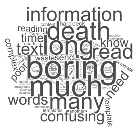
As you see, words like “boring”, “long”, “much”, “information”, and “many” dominate the visual (the word “death” also appears because of the popular phrase “Death by PowerPoint”; I choose to focus on the words that will help presenters improve).
Why are these words so prominent? I think what one respondent said is the key, “people do not differentiate between presentations and handouts.” So many presentations these days need to serve two purposes: the presentation, and as a document for later review. The choice many presenters make is to create a document and project it on the screen. That’s why another respondent said, “Presentations look like a Word or Excel file instead of PowerPoint slides.”
How can presenters serve the two needs without having to create multiple documents? I suggest that presenters include hidden slides in their PowerPoint file to give the additional detail that those reviewing the file later will need in order to better understand the message. These hidden slides don’t show up in Slide Show mode but can be shown if needed to answer a question. This allows you to create one PowerPoint file that serves both needs.
Audiences want the presenter to focus on serving the audience
As I said above, I think serving the audience should be the primary focus of any presenter. The audience members who completed the survey made this loud and clear when asked what suggestions they have for presenters. Their comments can be organized into three areas: the content of the presentation, the slides used, and the delivery of the presentation.
Content
The issue of the overload of content due to “brain dumps” was evident in the suggestions related to the content of the presentation. Audiences want the presenter to have a clear goal for doing the presentation. Gathering people together for 30 or 60 minutes is a huge cost in organizations and without a clear purpose, the audience feels their time is wasted. If you struggle to figure out what the goal of the presentation is, perhaps what you are really creating is a document that can be emailed to everyone (this article has eight considerations to think about when deciding which you are creating). This saves everyone time and uses the best medium for the communication.
Once the goal is clear, the audience wants there to be a clear structure and flow to the presentation. It is common today to say that the presentation has to tell a story. I don’t think every presentation needs to be a story with characters, a crisis, a hero, and other story elements. Presentations need a structure that moves the audience from where they are to the destination or goal of the presentation (that’s why I teach my GPS method of structuring your message: article with video; book). The structure has a logical flow the audience can follow to the end.
The respondents were clear that background and additional details should be available in a handout or other way, not displayed as part of the presentation. Using hidden slides as I described above is one option. You can also send a pre-read document to give context and background details or provide details in supplementary links people can refer to after the presentation (this article goes into more detail about these three options).
The audience wants a presentation that is tailored to them and their needs, not a generic deck that they have to figure out how it may apply in their situation. Take the time to tailor the presentation by understanding the needs of each audience and crafting the presentation for them (this is part of the GPS approach mentioned above). If you have similar presentations that need to be delivered to different audiences, consider whether using the Custom Shows feature of PowerPoint can save time by allowing you to define different shows within one PowerPoint file (learn more in this article).
Slides
The overload of information is usually seen as overloaded text slides, with paragraphs of text and few, if any, visuals. The audience members who responded to the survey want presenters to do better. Slides should start with a headline that summarizes the one point of this slide. Yes, each slide should only have one point, which makes it easier to understand for the audience and easier for the presenter to remember what this slide is about. Often the headline is already on the slide, just not at the top where it should be (this article shows four places headlines are often already on a slide).
Audiences want presenters to use more visuals instead of just text slides. The challenge for many presenters is selecting the right visual and the time it takes to create the visual. You can learn these skills. It won’t take as long as you think and your presentations will be much more effective (this video shows you categories for financial visuals and I wrote a book on selecting visuals based on the message.)
It’s not that text slides should be eliminated. I agree with the survey respondents that text slides are an important part of many presentations. But the practice of putting paragraphs of text on the slide has to stop. Audiences want only the key words in short points on the slide. Take the rest of the text and make it backup information. If you are using slide text to remind yourself what to say, move that text to the Slide Notes section to refer to while presenting (this article has options for speaker notes).
When using text on slides, whether it is part of text points or text that is part of a graph, diagram, or other visual, make sure the audience can see and read the text easily. Use colors that have enough contrast, fonts that are easy to read, and text in a large enough point size to be able to easily read it at the back of the room (resources for these: color contrast calculator tool, why select sans-serif fonts, and font size guidelines).
Delivery
Beyond the obvious advice of not reading your slides, the strongest suggestion on presentation delivery is to rehearse your presentation before you deliver it. Rehearsal isn’t just flipping through the slides. It is standing and delivering the entire presentation out loud. It is the only way to know how long it takes, how well it flows, and the only way to become more familiar with the content so that you don’t end up like one respondent wrote, “Presenter discovers slides at same time as audience.” Want to go the next step in improving your delivery? Record your rehearsal and use the tips in this article to watch the video and improve.
The audience also wants the presenter to engage them during the presentation. Face the audience, not the screen. This seems like a basic suggestion but it came up many times in the survey responses. If you don’t read your slides off the screen it is easier to always be facing the audience. Engage the audience through stories or examples of your point. Making it real for them keeps them paying attention. When presenting a list of text points or a diagram, build the slide piece by piece using the Animation feature of PowerPoint. When the audience only has to focus on what is new on the slide, they can focus more attention on what you are saying to explain the point.
Suggestions for specific types of content
In the 2019 survey I added questions related to different types of content that are common in presentations. I first asked how common each type of content was. Text slides were by far the most common, with tables/spreadsheets, graphs/charts and images/multimedia well behind in usage. Diagrams/timelines were the least used type of content.
All of these content types can be valuable, but I think the lower usage of the visual content types is because many presenters are intimidated by visuals. They don’t know which one to use for their message and they think it takes a lot of time to create a visual. With the right training, you can select and create visuals in a few minutes instead of spending hours struggling to create a visual.
I asked the respondents for suggestions on each type of content. These ideas can help presenters create slides in ways that will best serve the audience.
Text slides
For text slides, audiences don’t want the sentences and paragraphs that are far too common today. They want short points with a few key words in large fonts. They also don’t feel that the bullet point character is necessary, simply using space to separate the points is sufficient. They want presenters to look for ways to make text slides more visual, either by combining the text with images or icons or by replacing the text with visuals instead (this article gives you some options for making typical text slides more visual).
Graphs/Charts
Graphs (or charts as PowerPoint and Excel call them) are a visual way to represent data. Audiences like the visual, but only want to see the important data points so the graph is clear and easy to understand. Selecting the right graph for the message can be difficult but it is important so that the message conveyed by the visual is the correct message (this video introduces a way to select the right graph for different messages). The individual elements of the graph should also help the audience understand it. Select colors that reinforce the message and make sure explanatory text is large enough to easily read.
Images/multimedia
In the past, adding images to every slide was a popular trend. The survey respondents want presenters to know that this idea is often not a good idea. Any image should have a clear and distinct purpose on the slide, not be there for decoration. The images should be clear, high-resolution images that are large enough to easily interpret. Audiences increasingly know about intellectual property issues and specifically called out using watermarked images that are stolen from websites as an issue in too many presentations. When it comes to videos, keep them short and to the point. Save the videos as local files instead of trying to play a video from the Internet as this often leads to distracting and embarrassing connection issues. Test any multimedia files in the room before you begin speaking to ensure they will work during the presentation.
Diagrams/Timelines
I think these are the least used type of content because presenters don’t see how often a diagram could help describe a process or steps. When presenters become more familiar with the right diagram for the message, they can create simple and easy to follow diagrams for the audience (this article gives examples of diagrams that can communicate sequence or time-based messages). As with graphs, audiences only need to see the steps or timeframe that is needed for the message and the text needs to be big enough to easily read. For diagrams specifically, audiences find it helpful when the presenter uses the Animation feature in PowerPoint to build the diagram or timeline piece by piece using simple effects such as Appear or Fade instead of the crazy movement effects.
Tables/Spreadsheets
The overwhelming piece of advice was to not use spreadsheets on slides. This is a reaction to the slides we see with hundreds of cells from a spreadsheet in tiny font that people can’t read or understand. Respondents suggested using graphs instead for the message in the data. If a table of numbers is used, make it only a few rows and columns with the minimum required data using clean formatting and large fonts. Tables can also be used for comparison of options based on criteria and similarly text should be concise and large enough to read.
Conclusion
The respondents to the 2019 survey have done all presenters a huge favor by sharing openly and honestly what annoys them and what improvements they would like to see. To improve your presentations: 1) start with a goal that allows you to create a clear structure and flow to the message, 2) develop clear visual slides and move background and details to hidden slides or separate documents, and 3) rehearse so you are comfortable with the presentation and can focus on engaging the audience.
Don’t feel overwhelmed by the advice in this report. Pick one change you want to make, learn more from the links to articles and videos, implement the change, and build from there.
If you have a team who can benefit from a customized workshop where we can focus on improving the presentations you create, read more here. If you want to invest in your own development, learn more about my online course here.
To download this report in PDF format, right-click on this link and save the file to your computer: Results of the 2019 Annoying PowerPoint Survey.
Geetesh Bajaj of Indezine.com interviewed me about these results and our interview is below.
2022 update for virtual presentations
How have things changed with virtual presentations? I’ve been asking what annoys people about presentations through the pandemic and their responses show a clear shift in what annoys them. Yes, reading the slides is still annoying. Issues with font size and slide colors have declined due to people sitting close to bright high-res monitors instead of a dull projector across the room. Without problems reading the slides, audiences are now noticing much more the issues with no purpose and poor flow of presentations. Here’s how I explained the changes in a client workshop in early 2022.
Results of previous surveys:
To download this report in PDF format, right-click on this link and save the file to your computer: Results of the 2017 Annoying PowerPoint Survey. To download this report in PDF format, right-click on this link and save the file to your computer: Results of the 2015 Annoying PowerPoint Survey. To download the report on the 2013 survey in PDF format, right-click on this link and save the file to your computer: AnnoyingPowerPointSurveyResults2013.