As a business professional like an accountant, engineer, manager, or executive, how do you select visuals for your important presentations?
You likely rely on the same graphs or diagrams that you have always used. Sometimes you grab a cool slide a colleague created and modify it. But how do you know if you are selecting the best visual to communicate the message you are delivering on each slide?
 You’d like to use some of the effective visuals you see in business publications like the Wall Street Journal, but you don’t want to become a graphic designer. It would be great if there was a resource you could use to quickly select the right visual for any business message, with examples and instructions on how to create the visuals in the software you already use, Excel and PowerPoint.
Now there is. My book, Select Effective Visuals: The Business Professional’s Guide to Selecting and Creating Effective Presentation Visuals, is the resource you have been looking for.
Here’s what one reader tweeted:
“Professional reading recommendation: Select Effective Visuals by Dave Paradi. There are lots of crappy charts in DoD, they don’t have to be yours. Worth the purchase price just for the two-page chart that matches what kind of message you are trying to convey with the right chart. Best of all, he specifically designs his techniques to be achievable with out-of-the-box PowerPoint, no additional plugins needed. Perfect for our locked-down environment.”
Using the HVF approach in this book, you don’t need any graphics or design background to create an effective presentation visual. Follow these three steps:
- Write a Headline summarizing your message
- Select and create an effective Visual
- Focus the audience during delivery
The majority of this book deals with the hardest step for business professionals: selecting the appropriate visual. After reviewing tens of thousands of slides and working for years to develop a repeatable method of selecting the appropriate visual, I have concluded that almost every message in a business presentation can be organized into one of six categories. Those categories can be further broken down into 30 groups and sub-groups. I’ve identified 66 visuals that fit into those groups and sub-groups.
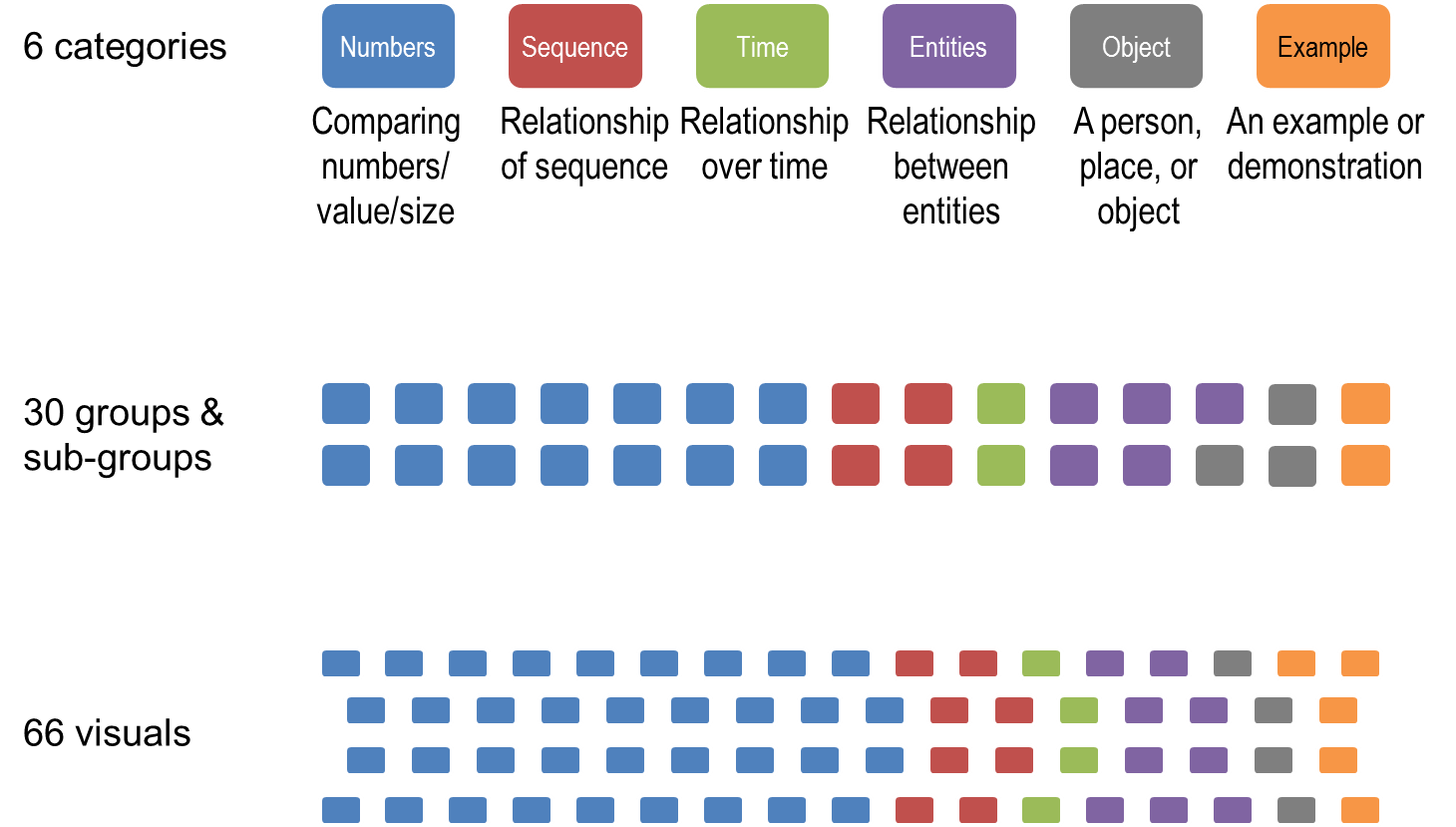
The book walks you through each category, the groups and sub-groups for that category, and the visuals that fit into those groups and sub-groups. You see examples of the visuals, when it can be used, and get instructions on creating that visual in Excel or PowerPoint. In all, there are 196 color examples in the book.
You will increase your visual inventory. Right now, you only use the visuals you have seen. After reading Select Effective Visuals, you will have an expanded inventory of visuals to use in your presentations. And you will have the knowledge of how to create them in the tools you are already familiar with. There is no need to use graphics software or learn data visualization programming languages.
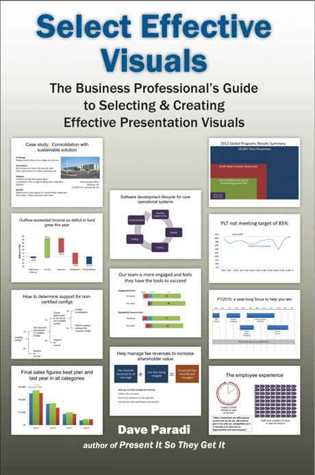
Here is a preview I put together that shows some of the visuals from the book.
[sc:SEVSlideShare]Click here to read the Introduction of the book to get more background on why I wrote it and what you can expect.
If you are ready to get started using more effective visuals in your presentations, order your copy of Select Effective Visuals: The Business Professional’s Guide to Selecting and Creating Effective Presentation Visuals today.
Printed books available from Amazon and other book retailers (list price is $29.95 USD but retailers set their own prices):
Buy here on Amazon or check your favorite book retailer
(For bulk orders of 10 books or more, contact me by email)
Kindle E-book version: Buy here on Amazon (list price is $19.95 but retailers set their own prices)
For owners: Click here for updates & additional resources (password published in the book required for access)
Wondering why you can’t find my book at Indigo/Chapters? Here’s why.

Dave Paradi has over twenty-two years of experience delivering customized training workshops to help business professionals improve their presentations. He has written ten books and over 600 articles on the topic of effective presentations and his ideas have appeared in publications around the world. His focus is on helping corporate professionals visually communicate the messages in their data so they don’t overwhelm and confuse executives. Dave is one of fewer than ten people in North America recognized by Microsoft with the Most Valuable Professional Award for his contributions to the Excel, PowerPoint, and Teams communities. His articles and videos on virtual presenting have been viewed over 4.8 million times and liked over 17,000 times on YouTube.