Why does it seem to be so difficult to effectively present financial statements, results or analysis? Executives, management, and stakeholders get confused by the slides full of spreadsheets and ask a lot of questions. In my surveys of audiences, they tell me that they want visuals instead of tables of numbers so the key messages are clear.
Here is an example of how to visually present the Net Income in an Income or P&L statement.
Here is an example of visually showing the assets or liabilities and the year over year change from the Balance Sheet.
And here is an example of showing a walk of budget and variance amounts for expense categories from the Income or P&L statement.
See, it is possible to effectively present financial statements, results, or analysis. If you want to see more examples of visuals, here’s a whole page of examples for financial topics organized by type of message you want to communicate. I also have articles on each of the three key financial statements: Income/P&L, Balance Sheet, and Cash Flow.
If you want to learn how to present financial statements, results or analysis more effectively, follow these links to jump to the topic that is most important to you right now.
Why presenting financial information is difficult and what audiences want in financial presentations
Use the GPS approach to create a clear message for your presentation while reducing information overload
How to select graphs and visuals based on the message they communicate
Save time by learning how to create graphs and visuals faster in Excel and PowerPoint
Why presenting financial information is difficult and what audiences want in financial presentations
Why does it seem so difficult to effectively present financial information? You may regularly present financial information such as monthly results, weekly performance against goals, or financial analysis. Your slides are full of spreadsheets and complex graphs you have copied in from Excel because that is what you have seen other financial professionals do.
But it doesn’t seem to be all that effective. Your audience, whether they are executives, management, or stakeholders, are overwhelmed with the information you present. They seem confused and end up asking lots of questions. You usually have to do more analysis before they will make a decision.
You figure there has to be a better way to present financial information so it is easily understood and acted on. There is.
First we need to understand why it seems so difficult. In my work with hundreds of financial professionals, it seems that there are three beliefs that hold them back from creating and delivering effective presentations.
“Everyone should love numbers as much as I do.”
Too many analysts mistakenly think that their audiences want every number they have and all the details behind the analysis. This is simply not true. Most people don’t have a great love of numbers, but they do need to know what the numbers mean to their department, area, or life.
“All the numbers need to be presented in case someone has a question.”
Copying spreadsheets of numbers onto slides has two negative reactions from most audiences. First, they get overwhelmed and they mentally check out, leaving the room without understanding the key messages the presenter needs them to understand. If they don’t check out, the second reaction is to find an obscure number on the slide (one that has nothing to do with the key message) and ask numerous questions to prove to others that they were paying attention. The presentation goes off track and the key messages get missed.
“I have to prove I can do my job well by presenting every calculation, all the analysis, and every detail I considered.”
If your boss has a problem with your job performance, they will set up a separate meeting with you one-on-one. The quality of your conclusion is more important than the quantity of the work. Executives can tell how well you did your work by how insightful your conclusion is and how it helps them make strategic decisions that benefit the business.
So what do audiences of financial presentations want to see? I asked them in a survey in March 2016 (full survey results are here). Let’s start with what they don’t want. They don’t want an overload of information. Unfortunately, that is what they get when financial professionals cling to the three beliefs listed above.
What do they want instead? Their responses were in three key themes:
- “Start with the message, not the data.” was the sage advice of one respondent. Financial professionals should determine the key message and then find the support for the messages, not start with the data and hope the audience figures out the messages.
- The presentation must be relevant to the particular audience, using terms they understand and making it clear what the analysis means to their area, project, or life.
- The slides should have easy to understand graphs and other visuals, not large tables of numbers. Adding callouts to explain key points in the visuals is also helpful.
Use the GPS approach to create a clear message for your presentation while reducing information overload
If you want your next presentation of financial or operational information to clear and focused, I suggest you start with planning your presentation.
Create a clear message for your presentation
Presenting financial information should not just be a data dump. Don’t start preparing for your presentation using the Grab & Hope method where you just grab slides from previous presentations and hope they come together into a coherent message. This article explains more about why this method is not effective and wastes time.
Use a GPS system as an analogy when planning your presentation. Start with the goal of the presentation (like the destination of a trip), evaluate the present situation (like the current location with a GPS), then determine the steps necessary to move the audience from where they are to where you want them to be (like the best route when taking a trip). This article explains more about the GPS system.
Declutter your slides
Putting spreadsheets on slides is the top annoyance in financial presentations according to the people who responded to my survey (full results here), so don’t just copy a table of numbers onto a slide. Many presenters feel they need all the data on their slides in case a question gets asked. In fact, you have three additional opportunities to share information with your audience: before the presentation in a pre-read, after the presentation in supplemental files, or behind your slides with hyperlinks to source files or hidden slides. This article explains this idea and when you move information to these other places, you can focus your message on the key points you need the audience to understand.
You may have heard the phrase “Less is More” and think that is what I am suggesting here. Not at all. I don’t believe that phrase makes sense at all, as I explain in this article. Your goal should be clarity of your message, and all that extra detail confuses the message for your audience.
Make sure you are giving executives what they need. Leaders need actionable insights on what needs to be done next. Insights that consider the context of the results, the relationships between the data and other factors. Spreadsheets only give them measurement results that answer what happened or performance results that answer how the results compare to a previous period or goal.
 Resource: GPS for Presentations book
If you want a structured approach to planning your presentations so they have a clear message and focused content, get my book GPS for Presentations.
How to select graphs and visuals based on the message they communicate
This is the step that is the biggest roadblock for many financial professionals: How to select the right visual for each slide. The key is to not start by looking at the data. Remember that the presentation is communicating key messages to the audience. Start with what message you are trying to communicate when you select a visual. Write your key message as a headline at the top of the slide, like a newspaper writes a headline for every story (use this template to write a headline that summarizes the result from your analysis).
Don’t select a visual just because it looks cool, select a visual that clearly communicates your message to the audience. I have an entire page of example visuals organized into the nine categories that I see professionals use most often in financial presentations. For each message you want to communicate, identify the category and then look through the examples in that category to select a visual that will effectively communicate that message.
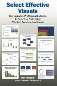 Resource: Select Effective Visuals book
As a business professional, how can you select the best visual for each message? Follow the approach in my book Select Effective Visuals. I break down almost every message a business professional will need to communicate into six categories. I break those down into 30 groups and sub-groups and 66 individual visuals. The book contains 192 color examples of visual and tips on how to create the visuals using Excel and PowerPoint, the tools you already have on your computer.
Save time by learning how to create graphs and visuals faster in Excel and PowerPoint
A large barrier to using visuals in presentations is the time it takes to create the slides if you don’t know the quick and easy ways to create visuals in PowerPoint. You could use Google to try to find tutorials but you never know whether the video or article you found is created by someone who is an expert and will show you the best technique. The best site for free PowerPoint tutorials is www.indezine.com, which is run by a recognized PowerPoint expert. They have tutorials for almost every feature in every version of PowerPoint. Some of the best tutorials for using Excel come from recognized experts Jon Peltier, Bill Jelen, and Chandoo.
When you are creating graphs, make sure they are clean and not cluttered. This article gives tips on cleaning up the default graphs in Excel/PowerPoint, this article gives tips on labeling graphs, this article explains when gridlines are helpful on line graphs, and this article shows how to replace the default legend with more effective labels. I also offer some calculators and tutorials for creating some non-standard graphs, such as waterfall graphs, diverging stacked bar charts, and treemaps.
If you prefer to create tables or graphs in Excel and copy them on to a PowerPoint slide, you need to be aware of the potential advantages/disadvantages of each method. Along with Glenna Shaw of www.visualology.net, I created a table of every copy/paste method as of Office 2013. If you want to link a table of cells from Excel to a PowerPoint slide, read this article. If you want to link a graph from Excel to a PowerPoint slide, read this article. In each article you will also learn why linking may not give you what you really need, and why creating the table or graph in PowerPoint might be better. I have an e-course that goes into depth on this topic with videos of each of the key methods for using Excel content in PowerPoint.
The information above and the articles, makeovers, and resources above will be very helpful. But the best way for you and your colleagues to make a step change improvement in the way you present financial information is to set up a customized on-site workshop. My two-day sessions include in-depth discussion of the GPS approach to planning your message and focusing the content. We go through the HVF approach to create effective slides, learning how to select the correct visual and I show many makeovers of your actual slides so you can see the ideas applied to the information you present. The second day is hands-on practice creating the visuals, including ways to set up your Excel and PowerPoint files so weekly or monthly updating is quick and simple. You can learn more about my customized workshops here.
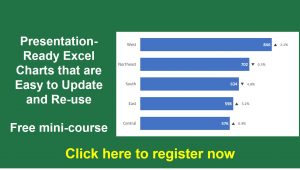
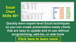
I also offer in-person training workshops to improve a team’s skills in using Excel to create effective graphs. In mid-2019 I will be releasing a new ecourse that shares expert-level techniques for advanced Excel graphing without using plug-ins, add-ins, or VBA programming. You can get on the priority notification list if you are interested.
You can also spend less time creating visuals when you start with something that is already partially done. This page on my site allows you to download 77 pre-made visuals for communicating a message that is time based, such as a timeline or calendar. This article shows you sites to get free vector icons for use on your slides. And this article shows you how to use a site that has over 4,000 professional sequence and relationship diagrams.
 Resource: Implementation Guides
Getting tips on the functions of PowerPoint or Excel is good, but not as good as learning the exact steps to create the visuals you want. That is why I have created my Implementation Guides. These are the handouts I use in my customized workshops to give step-by-step instructions that the participants can follow to create many of the effective visuals I show them. If you want to create graphs in PowerPoint that are clear and impactful, these guides will save you hours of time. I also cover the specific methods for copying or linking Excel cells or graphs to PowerPoint.