Andy Kriebel and Andy Cotgreave, two data visualization experts in the UK have started the Makeover Monday Challenge. Each Monday they makeover a visual that they found and ask the community to post their versions. The idea is that by seeing many different ways to visually show the same data, we all learn. The restriction is that they ask you to complete the makeover in under an hour. You can read more about the challenges at http://vizwiz.blogspot.ca/p/makeover-monday-challenges.html?m=1.
Both Andy’s are Tableau experts, but they invite people to use any tool they wish. I like that they have restricted the work to a maximum of 60 minutes. The reality for most business professionals these days is that we don’t have hours to spend creating visuals, we have so much other work to do.
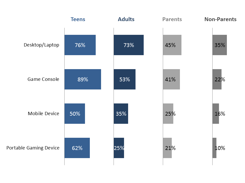
The challenge this week is from an article in Forbes (http://www.forbes.com/sites/kevinanderton/2015/12/31/adults-vs-teens-video-game-edition-infographic/#1cc3651e6956) comparing the video game devices used by different segments of the population in a survey. When I saw it, I immediately thought of a small multiples bar chart. This is a more complex visual for many business professionals, as it requires multiple graphs to be lined up with each other. I find this visual useful when you want to compare the trend in multiple data series, as is the case here. The author wanted to show that 1) teens tend to play more on game consoles and adults on a computer and 2) that parents play more video games than non-parents (my guess is that they play with their kids, having done that myself when our kids were younger).
To make this type of visual easier to produce, I create multiple graphs within a single stacked bar (or column) graph. The trick is to create appropriately sized invisible spacer segments that make the visible segments that make up the different graphs line up. To ease the calculation burden, I created a calculator that does the work for you.
Using my calculator, I created this visual in about 15 minutes in PowerPoint 2010 (it can also be created in Excel):
I used PowerPoint because that is my area of expertise, but also to show presenters that you don’t need a fancy tool to create more complex visuals. Since the graphing engine in PowerPoint and Excel are the same, it could also have been created in Excel.
The original visual looked at Teens vs. Adults and Parents vs. Non-Parents, so I paired similar colors to distinguish the groupings in my chart. The baselines are gridlines in the stacked bar chart that is used.
If you want to get my calculator for small multiple bar or column graphs, along with calculators for six other visuals, go to https://www.thinkoutsidetheslide.com/calculators-for-visuals/. When you get the Excel file, you also get a link to a page with videos that show exactly how to use the calculators.
Thanks to Andy & Andy for this project and continuing to show professionals that more meaningful visuals are possible without a huge amount of effort and by using the tools you already have on your desktop.

Dave Paradi has over twenty-two years of experience delivering customized training workshops to help business professionals improve their presentations. He has written ten books and over 600 articles on the topic of effective presentations and his ideas have appeared in publications around the world. His focus is on helping corporate professionals visually communicate the messages in their data so they don’t overwhelm and confuse executives. Dave is one of fewer than ten people in North America recognized by Microsoft with the Most Valuable Professional Award for his contributions to the Excel, PowerPoint, and Teams communities. His articles and videos on virtual presenting have been viewed over 4.8 million times and liked over 17,000 times on YouTube.