If you read articles by data visualization experts on the topic of measurement axes that don’t start at zero, you will find one common theme: strong opposition to the idea. While I agree with them in most cases, I want to suggest an exception to this rule.
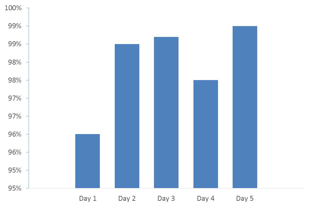
Let’s start with the key issue. By default, Excel and PowerPoint select the minimum and maximum values for the measurement axis on a graph. For example, the vertical axis on a column graph is the measurement axis. I haven’t been able to figure out how the programs select these values. It seems to depend on the values in the data.
The problem comes when the axis does not start at zero. What the programs seem to be trying to do is to make the difference in values easier to see by adjusting the starting value of the axis. This can lead to misinterpretation by the audience. This is especially true when there are no data labels and the audience is only comparing the height of the columns. In this example, the default chosen by PowerPoint makes the values for Day 2-5 look like they are double the value of Day 1, when that is not the case.
The common advice from the data visualization experts is to always start your measurement axis at zero so that the relative size of the columns or bars is always showing an accurate picture of the values being represented. Here is the above graph with the axis starting at zero.
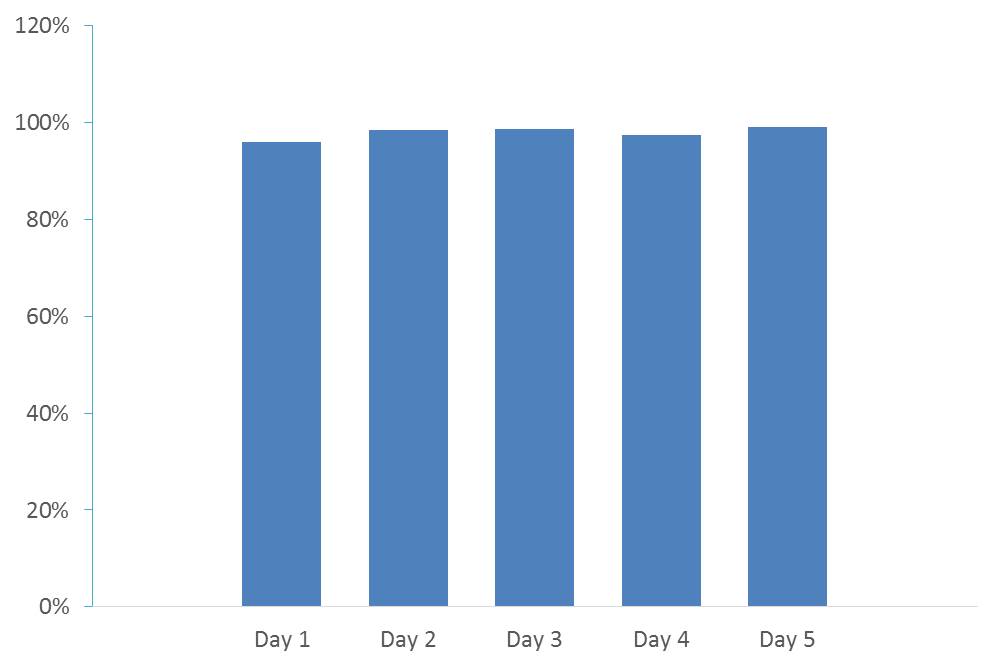
The comparison is more accurate, but now the challenge is being able to distinguish the values in the different days because the heights of each column are so similar.
In most cases, starting the measurement axis at zero is the right approach because we want to accurately portray the data in a visual. The example above illustrates the exception I see in this rule. When the values are close to each other and the expected values are within a certain range, then I think it is OK to not start the measurement axis at zero.
In the above example, the presenter and audience know that the expected values are between 90% and 100%. This equipment operates within a known tolerance and the real message is where the values are within that expected range. In this case, the segment of the column from 0% to 90% does not add any value for the audience.
In this situation I suggest creating a graph that has a minimal measurement axis, just showing the lower and upper expected range as the minimum and maximum values. The columns can then use data labels to show the exact values for the audience. Here’s what that graph looks like.
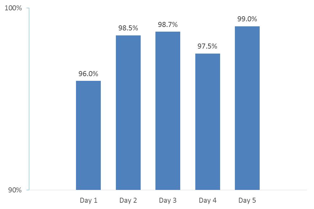
As the presenter, you are now showing an accurate view of the important data. Having the minimalist measurement axis is important so you are transparent and identify that the column heights are not relative to a zero base. The important data is between 90% and 100%, which is all that is being shown.
As with all presentation of data, context is key. Only use a non-zero based measurement axis when the expected range is known and the message is about the values within that range. Other than this situation (& perhaps a few other situations), start your measurement axis at zero to give an accurate view of the values.

Dave Paradi has over twenty-two years of experience delivering customized training workshops to help business professionals improve their presentations. He has written ten books and over 600 articles on the topic of effective presentations and his ideas have appeared in publications around the world. His focus is on helping corporate professionals visually communicate the messages in their data so they don’t overwhelm and confuse executives. Dave is one of fewer than ten people in North America recognized by Microsoft with the Most Valuable Professional Award for his contributions to the Excel, PowerPoint, and Teams communities. His articles and videos on virtual presenting have been viewed over 4.8 million times and liked over 17,000 times on YouTube.