In a recent customized workshop a participant asked how to show performance of a metric where the objective is to be below a goal. Typically we want to show performance and being above the goal is considered better performance. In this case, where they were measuring response time in a customer service setting, the desire is to respond quicker than the standard.
One of the common visuals I show to measure performance relative to a goal is a dashed line on a column graph, like this example.
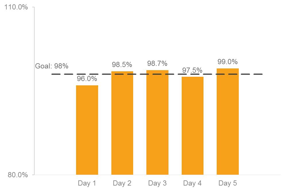
In this visual, it is easy to see if our performance is above the goal because the column extends above the dashed line representing the goal. If we were to use this type of visual to measure response time, the column would be below the goal in situations where we performed better than the standard. This would be hard for the audience to understand, since it is opposite to the typical interpretation of this type of visual.
I spent some time thinking about this challenge. I wanted to find a visual that could work for this situation. I searched for what other data visualization experts had come up with and didn’t find anything for this situation. After some different attempts, here’s the visual I came up with.
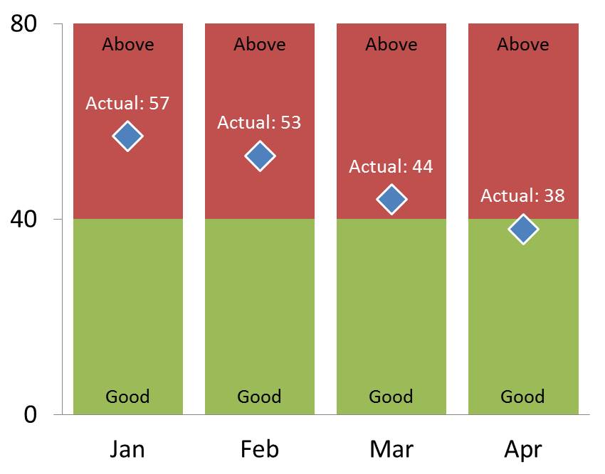
The audience needs to know which area represents good performance and which area represents performance above the standard. I use the red and green colors in a stacked column chart to create these areas. I added labels to the areas for those who have a form of color deficiency that would not allow them to see the red and green segments in those colors.
The actual performance values are created using a line graph with markers. The line is invisible, but the markers have been set to be prominent so they stand out on either the red or green segments behind them. I added a data label to the markers so that the audience knows the actual values each month.
The vertical axis is set to only have three values showing: zero, the goal value, and the maximum. This makes it easy for the audience to determine the goal value and clearly shows the scale of the data being shown.
This visual was created in PowerPoint 2010, but could have been created in Excel instead. It uses the basic graphing functionality and does not require any macros or programming (which most corporate IT departments wouldn’t allow).
I hope you find this visual useful for situations where performance is considered better when it is below a goal or standard. Let me know in the comments on LinkedIn if you have improvements on this visual or you have an alternative visual that you use for this situation.

Dave Paradi has over twenty-two years of experience delivering customized training workshops to help business professionals improve their presentations. He has written ten books and over 600 articles on the topic of effective presentations and his ideas have appeared in publications around the world. His focus is on helping corporate professionals visually communicate the messages in their data so they don’t overwhelm and confuse executives. Dave is one of fewer than ten people in North America recognized by Microsoft with the Most Valuable Professional Award for his contributions to the Excel, PowerPoint, and Teams communities. His articles and videos on virtual presenting have been viewed over 4.8 million times and liked over 17,000 times on YouTube.