One common mistake I see professionals make when presenting analysis is not ordering the data in a way that supports the message they are trying to communicate. This isn’t done intentionally, but happens because they accept the default order of data that comes from the source system.
The data we use in analysis often comes from a source system, such as an operations control system, call center tracking system, or sales process system. The system organizes the data in a way that makes sense for the tracking system, which could be by date, by customer, or alphabetically by product. We extract the data from the system and analyze it to find insights that will help move the organization closer to its goals.
The challenge comes when we go to present the results of that analysis. Often the results are in the same order as the data was when we first imported it. If we just accept the default order, we often make the audience do work to figure out how the data or visual supports the message. Here is an example from a recent customized workshop.
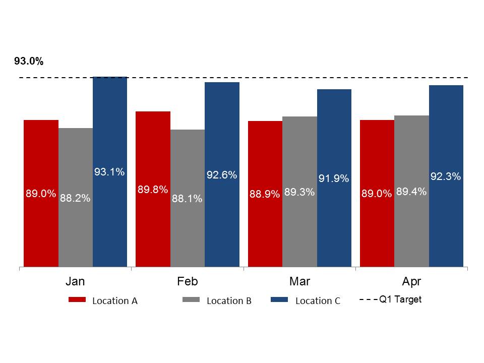
The tracking system ordered the data by month because it is collected each day. The message of this slide was about how each location was doing compared to the goal that had been set. In order to see how each location was progressing towards meeting the goal, the audience has to connect the columns for each color across the four months. This is work that the audience may not be willing to do, or may not do correctly.
Instead, as a presenter, we should order the data so it supports our message. Here is the visual I created instead of the original.
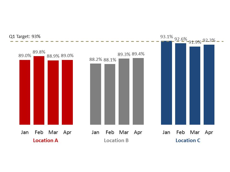
I grouped the data by location so the audience can easily see the performance in each location relative to the goal. I used the same colors for the three locations and added a blank column between the groups of columns in order to make it easier to separate the locations when looking at the visual.
When you are presenting the results of analysis, don’t accept the default order from the source system. Take the time to group the data in a way that supports the message you are delivering.

Dave Paradi has over twenty-two years of experience delivering customized training workshops to help business professionals improve their presentations. He has written ten books and over 600 articles on the topic of effective presentations and his ideas have appeared in publications around the world. His focus is on helping corporate professionals visually communicate the messages in their data so they don’t overwhelm and confuse executives. Dave is one of fewer than ten people in North America recognized by Microsoft with the Most Valuable Professional Award for his contributions to the Excel, PowerPoint, and Teams communities. His articles and videos on virtual presenting have been viewed over 4.8 million times and liked over 17,000 times on YouTube.