I have written about the problems with dual axis graphs in the past. One situation where some presenters say dual axis graphs are necessary is when the two data series being compared are measured in very different units. In this case, they say that you need a dual axis graph because the measurement units aren’t the same.
I dealt with this situation recently in one of my customized workshops and I think there is a better alternative to a dual axis graph, even if the measurement units are different. A dual axis graph can still be a problem because the two axes can be manipulated to tell very different stories.
Let’s consider the situation where we want to show the trend in unit sales and in revenue for a division in an organization. This is a classic case where many presenters would use a dual axis graph because one series is measured in units and the other series is measured in dollars. Here is what a presenter would typically show, using the default axes PowerPoint uses for the data values in each series:
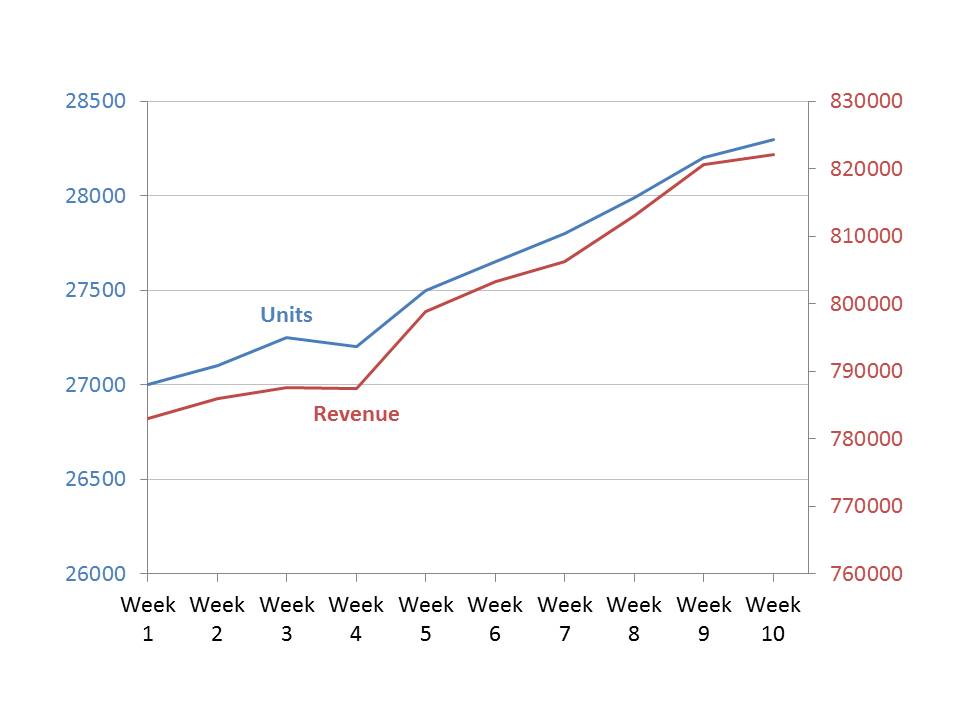
The problem is that a presenter can manipulate one axis (or both axes) to make the visual tell a very different story. For example, if we change the scale of the Revenue axis to start at zero, here is the graph we get:
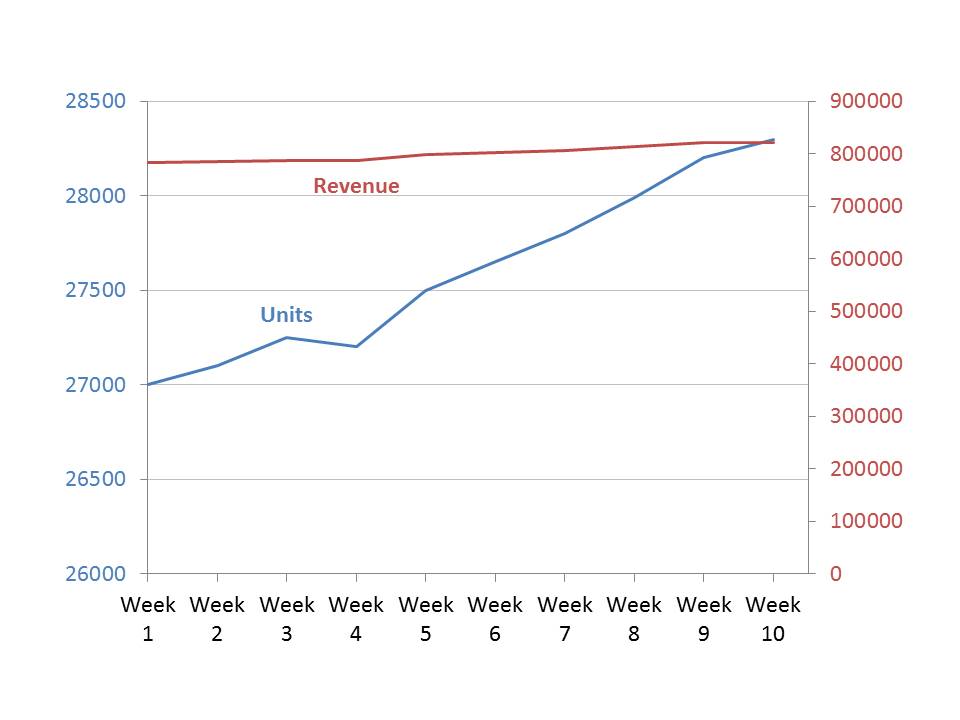
Now it looks like the revenue has not been growing much as units sold have increased dramatically. This is not necessarily the case. You have to do a lot of analysis as an audience member to figure out the true story.
A better visual to use when the two data series are measured in different units is a multiple index line graph. Indexing is a concept from economics and it allows trends in multiple data series to be easily compared. Indexing sets the initial value of each data series to 100, and then calculates the other index values in the data series based on the difference of each data value to the initial value.
When we do this for the above data series, we can plot them on the same measurement axis and the graph we get is:
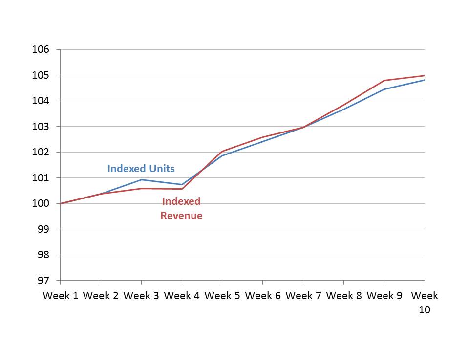
Now we see that the revenue did not grow as fast as units in the first four weeks, but has grown faster than units since then. Because we are now comparing the two series on the same measurement basis, the comparison is valid and cannot be manipulated.
I have found this multiple index line graph a good visual to tell the true story when communicating a message about growth in two data series that are measured using different units. Consider this type of visual the next time you have to present this type of message.

Dave Paradi has over twenty-two years of experience delivering customized training workshops to help business professionals improve their presentations. He has written ten books and over 600 articles on the topic of effective presentations and his ideas have appeared in publications around the world. His focus is on helping corporate professionals visually communicate the messages in their data so they don’t overwhelm and confuse executives. Dave is one of fewer than ten people in North America recognized by Microsoft with the Most Valuable Professional Award for his contributions to the Excel, PowerPoint, and Teams communities. His articles and videos on virtual presenting have been viewed over 4.8 million times and liked over 17,000 times on YouTube.