Almost all my clients are still using PowerPoint 2010, but I am starting to see the move to PowerPoint 2013 or Office 365. When I teach public workshops, I see more and more people coming with these newer versions of PowerPoint on their computer. Since I talk a lot about graphs, I want to point out some changes in the graph formatting interface when you move from PowerPoint 2007/2010 to PowerPoint 2013 or later.
The biggest change is the move of most of the Layout ribbon to the Design ribbon. The buttons for formatting the axis, data labels, gridlines, title, etc. are now contained under the Add Chart Element drop down button on the Chart Tools Design ribbon.
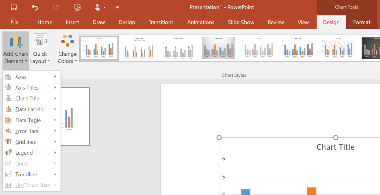
All of the same formatting tools are there, you just access them by clicking on the tools and selecting an option from the next level of menu that pops out.
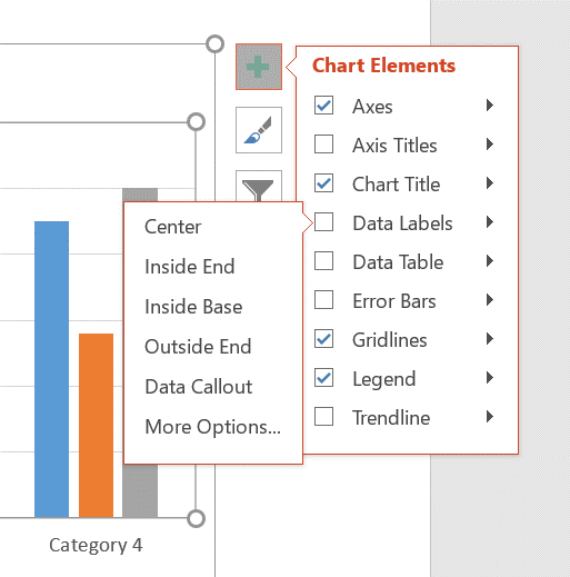
PowerPoint 2013 introduced a new faster way to access these graph formatting options. After you add a graph to the slide, a column of buttons appears to the right of the graph. The top button is a plus (+) sign and is the quick way to access the formatting options. Click on the plus sign and you can use checkboxes to select which elements are included on the chart. You can click the arrow to the right of each element to select options for that element. This is a quick way to access the formatting tools.
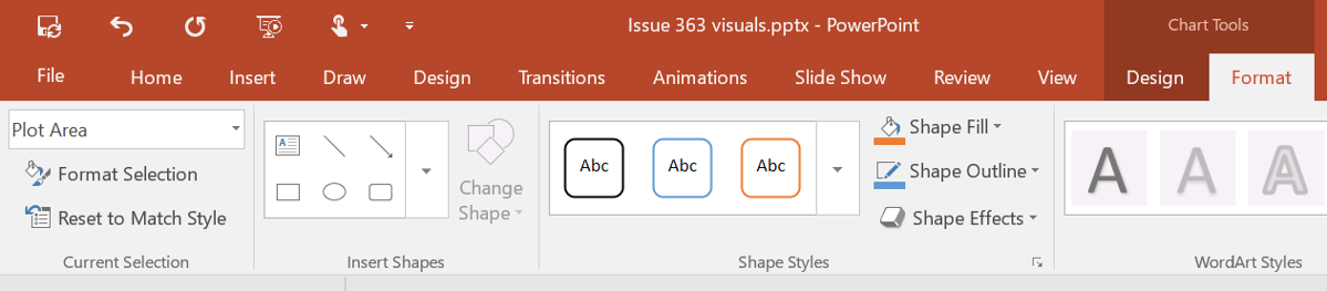
The other key element of the Layout ribbon, the Current Selection section, is now located only on the Chart Tools Format ribbon. It was already there and was a duplication of the same section on two ribbons. If you were used to finding this section on the Layout ribbon, it is in the same spot on the left of the Format ribbon. The selection tools can be used to select a data series or other chart element when you can’t click on it in the graph because it is hidden behind another element or is too small to click on. Then you can use the Format Selection button to access the formatting options for that element.
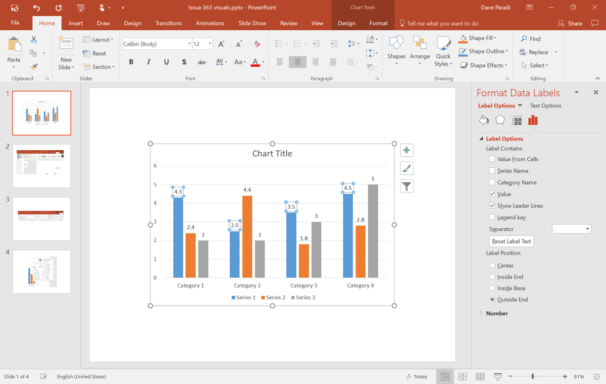
The final major change to graph formatting is the new Office standard of task panes instead of dialog boxes. Instead of a dialog box popping up over the slide where you could set the options, a task pane now slides in on the right of the slide. The options are organized a little differently and you may have to search through some of the sections to find the one you are looking for. What is nice about the task pane is that it does not cover up the slide and you can see formatting changes reflected on the graph as you make the changes in the task pane.
As your organization moves to a newer version of Office in the next few years, keep these changes in mind so you can be as productive as before using the new graph formatting interface.

Dave Paradi has over twenty-two years of experience delivering customized training workshops to help business professionals improve their presentations. He has written ten books and over 600 articles on the topic of effective presentations and his ideas have appeared in publications around the world. His focus is on helping corporate professionals visually communicate the messages in their data so they don’t overwhelm and confuse executives. Dave is one of fewer than ten people in North America recognized by Microsoft with the Most Valuable Professional Award for his contributions to the Excel, PowerPoint, and Teams communities. His articles and videos on virtual presenting have been viewed over 4.8 million times and liked over 17,000 times on YouTube.