What does an audience think when they see a math error on a slide? Do they ignore it and trust the numbers the presenter is discussing? Or do they start to question all the numbers and wonder what other mistakes there might be? My experience is that they start to question the numbers they are seeing, and they also question the conclusions the presenter is sharing, since they aren’t sure whether the numbers the conclusion is based on are true.
It is surprising to me the different types of mathematical errors I see on slides. Earlier this year I discussed an error that can occur when rounding numbers in Excel – here is the article in case you missed it.
Other errors come from the presenter just not checking what is on the slide. I have seen a column of numbers added to a total and one of the numbers was missed, giving an incorrect total. When you are checking your presentation – you do check your presentation before you deliver it I hope – use a calculator to add up numbers shown to make sure the total is correct.
Other errors leave the audience wondering if the numbers are correct. Here is one from a recent presentation.
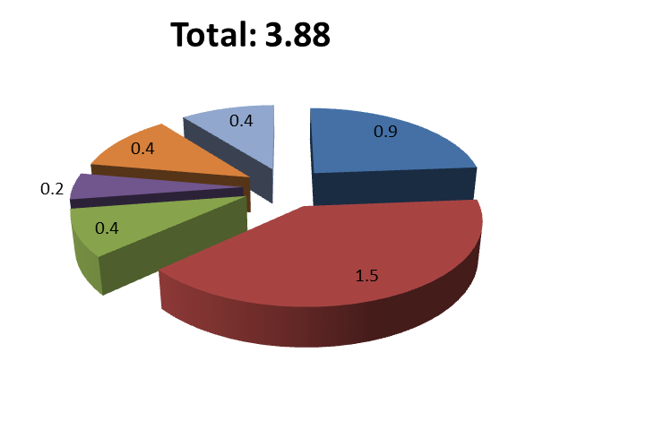
The problem here (other than the 3-D pie chart) is that the total and the components have a different number of decimal places. The components can never add to the total because the level of precision is different. Check to see that related numbers have the same level of precision so that an error is not displayed.
Another recent table showed a calculation that left the audience wondering about the numbers.
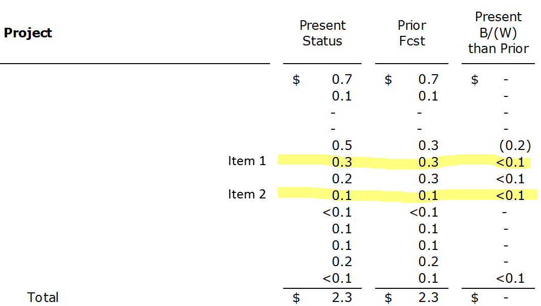
It is clear that the difference column on the right is being calculated with a different precision than the two columns shown that are apparently being used to calculate the difference. In the two highlighted rows, we see the exact same number for the Present and Prior values, but there is a non-zero value in the difference column. Rows below the highlighted ones show the same Present and Prior values with no difference. This confuses the audience and makes them question the analysis and the conclusions being presented.
If we want our audience to trust the conclusion from our analysis, we need to make sure the numbers we show do not lead to questions about the validity of the work. Check that numbers add up as shown, and pay attention to the precision of numbers to make sure no errors have been introduced that way.

Dave Paradi has over twenty-two years of experience delivering customized training workshops to help business professionals improve their presentations. He has written ten books and over 600 articles on the topic of effective presentations and his ideas have appeared in publications around the world. His focus is on helping corporate professionals visually communicate the messages in their data so they don’t overwhelm and confuse executives. Dave is one of fewer than ten people in North America recognized by Microsoft with the Most Valuable Professional Award for his contributions to the Excel, PowerPoint, and Teams communities. His articles and videos on virtual presenting have been viewed over 4.8 million times and liked over 17,000 times on YouTube.