As I write my next book which is due out in late spring, I am forced to think deeply about the decisions business professionals should make when selecting visuals for their slides. One of those decisions is whether to select a column chart or a line graph when showing a trend or direction in the data. In this article I want to share the differences between the two graphs and how you can select the correct visual to show a trend.
As I show in this SlideShare on selecting visuals for business presentations, there are six categories of visuals. Both a column chart and a line graph fall into the category of visuals that compare values to each other. Just because they are both in this broad category, however, doesn’t mean they both work for showing trends.
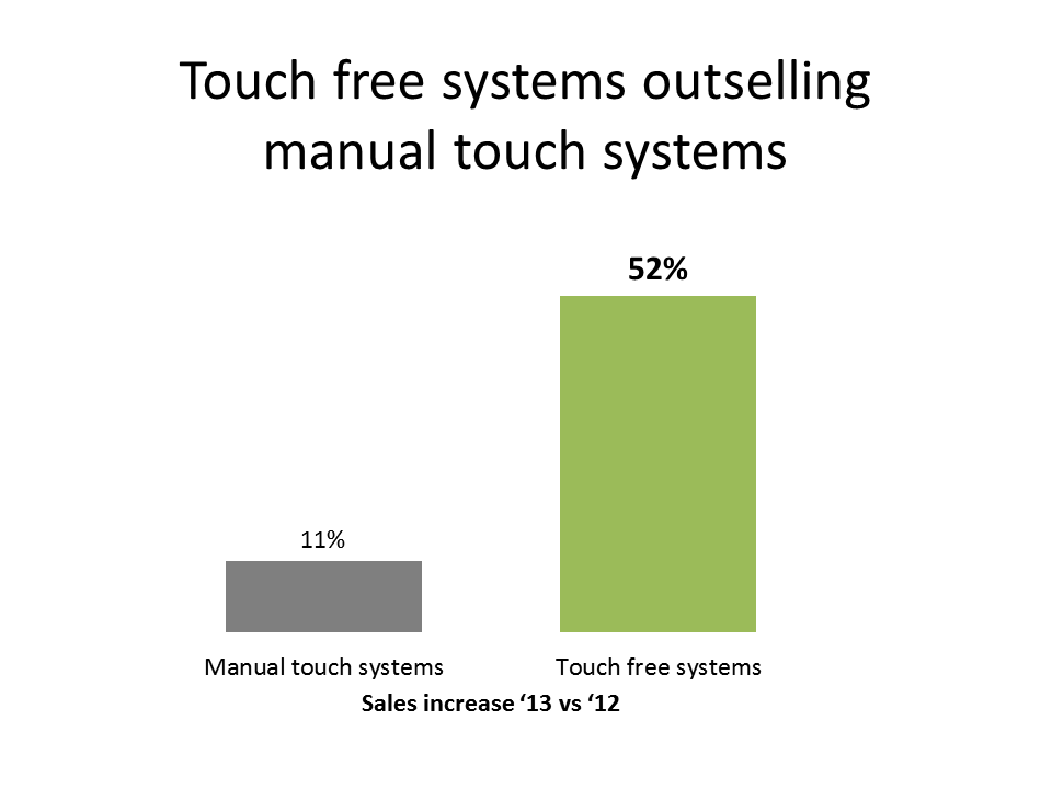
A column chart is best used when the comparison shows which values are higher or lower than the other values. The collection of values give context for the few values that we want the audience to focus on. There are usually relatively few values being compared, typically no more than 6-10, although in certain situations more values will work. Here is an example of a column chart that compares sales of two types of systems:
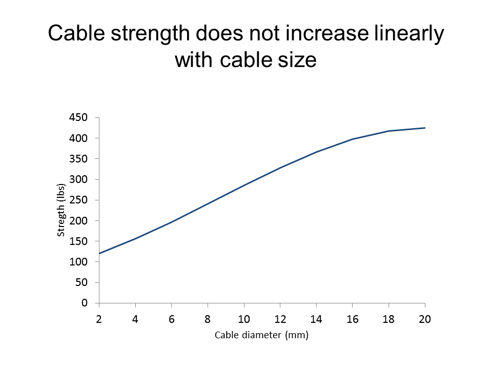
A line chart is the visual to use when the message you want to communicate is an increasing or decreasing trend. There are typically more data points in a line graph than a column chart. In reality, the values don’t matter as much as the trend because that is the message you are communicating. Here is an example:
A column chart should not be used to show a trend in the data. While a column chart can show an increasing or decreasing trend, it does not do it well because the audience becomes confused trying to connect the columns to see the direction or trend of the values. Do they connect the leading edge of the column, the middle of the column, or the trailing edge of the column? While the two edges are the easiest to connect visually, the truth is that the middles of the columns, the hardest spot of the column to use, should be connected to create the trend. If you are forcing your audience to create a line connecting the tops of the columns in their head, why not do the work for them? A line graph is far easier for the audience to understand.
The conclusion: when showing a trend, use a line graph.

Dave Paradi has over twenty-two years of experience delivering customized training workshops to help business professionals improve their presentations. He has written ten books and over 600 articles on the topic of effective presentations and his ideas have appeared in publications around the world. His focus is on helping corporate professionals visually communicate the messages in their data so they don’t overwhelm and confuse executives. Dave is one of fewer than ten people in North America recognized by Microsoft with the Most Valuable Professional Award for his contributions to the Excel, PowerPoint, and Teams communities. His articles and videos on virtual presenting have been viewed over 4.8 million times and liked over 17,000 times on YouTube.