In this article I am going to share a couple of innovative ways to use the built-in graph data label feature of PowerPoint to make your graphs more effective.
I’ve always taught that if the built-in data labelling feature does not work for your graph, just add text boxes with the labels you need. And I have often resorted to text box labels myself. I would prefer to use the data label feature because the labels are tied to the data and they move with the graph when it is resized or repositioned. But I often couldn’t get the data labels to do what I wanted. Recently I discovered two new techniques that have reduced my use of text boxes for graph labels.
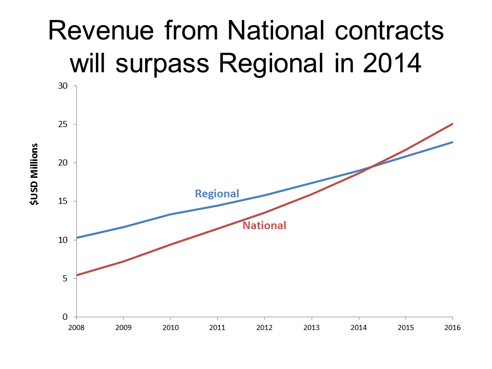
1. Labelling lines in a line graph
I teach my workshop participants to remove the default graph legend because it is not as effective as a label placed close to the line. I have always used a text box label for this, until I recently ran across a great tutorial from Stephanie Evergreen on directly labelling graphs. Stephanie reviews how to add a data label in Excel to only one data point, which allows you to add the data series name as the label. I think this is brilliant.
So how can you use Stephanie’s idea in PowerPoint? Quite easily, since Excel and PowerPoint use the same graph engine. Simply select the line, which highlights all the data points. Click on the one data point you want to add the label to. Stephanie shows the example of adding the label to the right of the line, but sometimes you will want to add the label above or below the line in the middle because it fits better. With this one point selected, add a data label that includes only the series name. Now the data label is tied to the data in the graph data table and will move as the data in the line changes, the entire graph is resized, or the graph is repositioned on the slide.
Once the label has been added to the graph, you can reposition it by selecting it and dragging it to a new position if it slightly overlaps the line. I suggest you also format the label as bold text and change the text color to match the color of the line it represents.
Here is an example of a graph where the series name labels are in the middle of the graph area.
2. Displaying positive values when the graph data table requires negative values
If you want a bar in a bar chart to be on the left side of the vertical axis, you have to use a negative value in the graph data table. That is fine if the value you want to display is negative. But when you are using a diverging stacked bar chart (as I wrote about in this article), the negative value is only used to position the bar, the value you want displayed is actually positive. The default data labels will appear like this.
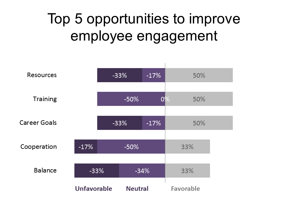
How do you change the display of the value while still using the built-in data labels? I recently discovered a solution using the custom number formatting you can apply to the data label. By applying a custom number format that displays negative numbers as positive numbers, you can have all the numbers display as positive numbers. You can also have any zero values not display at all to handle the situation you see above in the Training category. For example, a custom number format of “0.0%;0.0%;” will display positive values as a percentage with one decimal place, negative values as a percentage with one decimal place, and will not display zero values. To explore the full set of options for custom number formats, see this article from Microsoft (it is written for Excel, but applies to this usage in PowerPoint as well).
Here is an example of this number format approach applied to the diverging stacked bar chart example above.

As I mentioned at the start, I prefer using the data label feature of PowerPoint if possible, and these two techniques have allowed me to use it in more situations. Apply them to your graphs and see how they can reduce the extra text box label you need to add and manage on slides with graphs.

Dave Paradi has over twenty-two years of experience delivering customized training workshops to help business professionals improve their presentations. He has written ten books and over 600 articles on the topic of effective presentations and his ideas have appeared in publications around the world. His focus is on helping corporate professionals visually communicate the messages in their data so they don’t overwhelm and confuse executives. Dave is one of fewer than ten people in North America recognized by Microsoft with the Most Valuable Professional Award for his contributions to the Excel, PowerPoint, and Teams communities. His articles and videos on virtual presenting have been viewed over 4.8 million times and liked over 17,000 times on YouTube.