I follow copyblogger.com because I find their information useful to my business. Yesterday they released a report on the state of native advertising (here is the full report). It doesn’t matter whether you know what that is (I didn’t initially). I want to explain why two of the graphs showing the results of their survey are confusing, and how they can be improved.
Here is the first graph I found confusing.
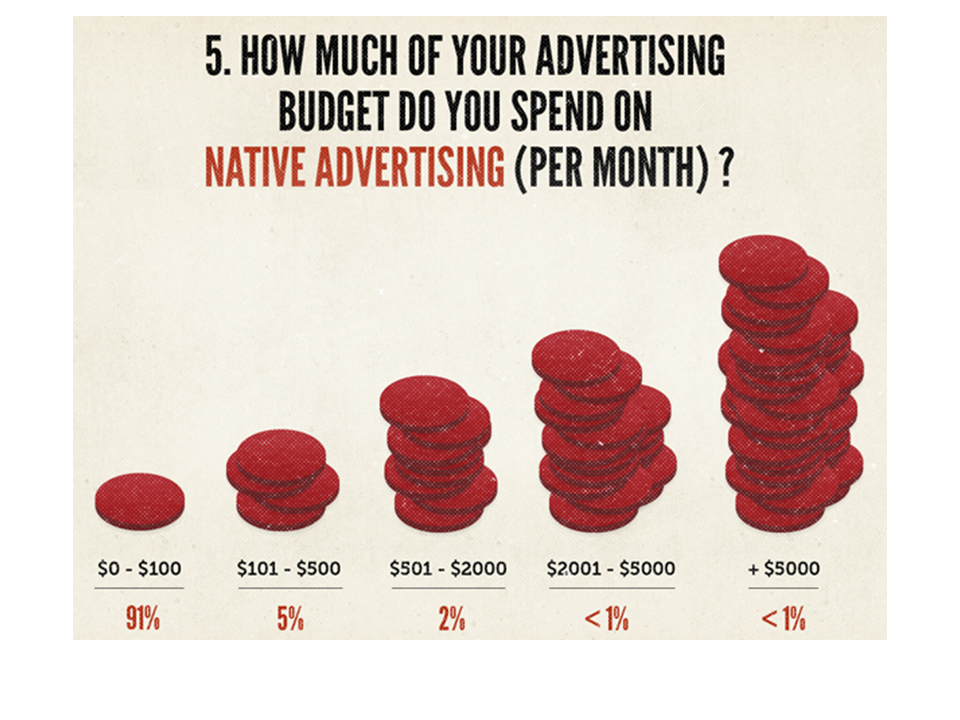 They are trying to show that the vast majority of advertising budgets do not spend much on native advertising. The problem with this graph is that the heights of the stacks of coins do not represent the data. They are category labels. To find the data, you have to look at the bottom and figure out the percentages. This is backwards to what people expect and makes it very confusing. The data should be the prominent part of the graph, not the category labels.
Here is how I re-did this graph in PowerPoint.
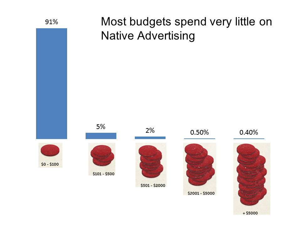
Now the data is the focus. I used their stacks of coins at the category labels to illustrate how you can use images instead of the standard text labels.
The second graph I found confusing was this one.
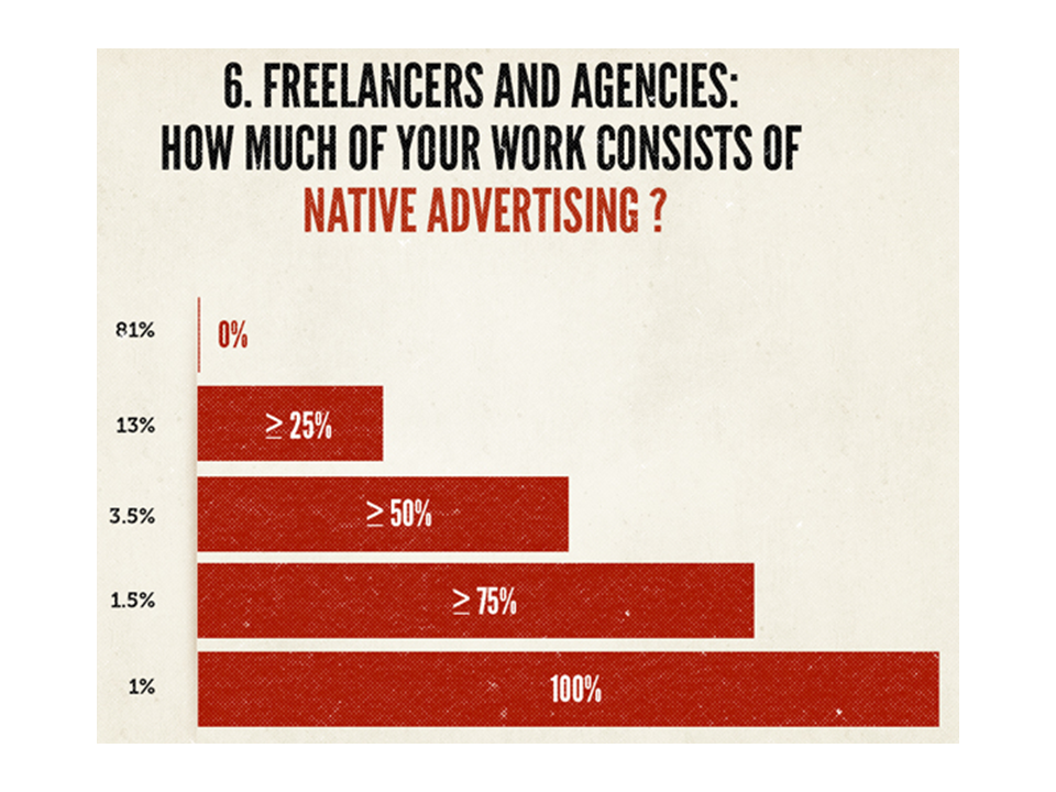
They are trying to show the breakdown of responses in different categories, but again, the categories and data are switched, making it hard to figure out. If they wanted to use a bar graph, I would suggest the following instead.
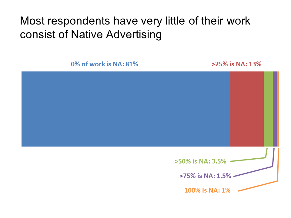
In this graph, we clearly see that the vast majority of respondents do very little work in the area of native advertising.
The lesson for all of us when presenting data is to make sure we remember what the focus of a graph is supposed to be: the data. Otherwise, it confuses the audience.
P.S. If the folks from Copyblogger read this, I’ll see you at the Authority Intensive in May – I’m looking forward to it!

Dave Paradi has over twenty-two years of experience delivering customized training workshops to help business professionals improve their presentations. He has written ten books and over 600 articles on the topic of effective presentations and his ideas have appeared in publications around the world. His focus is on helping corporate professionals visually communicate the messages in their data so they don’t overwhelm and confuse executives. Dave is one of fewer than ten people in North America recognized by Microsoft with the Most Valuable Professional Award for his contributions to the Excel, PowerPoint, and Teams communities. His articles and videos on virtual presenting have been viewed over 4.8 million times and liked over 17,000 times on YouTube.